
Free Ghost themes compared: Source, Casper, London and Ruby
Source for a newsletter, Casper for a classic blog, London for photos, Ruby for lots of posts.
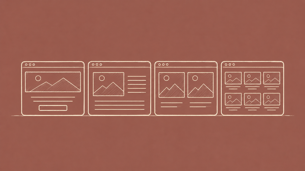
Pick a free Ghost theme by what a reader should see first: a signup box, one big story, a wall of photos or a grid of cards. That is the real difference between Source, Casper, London and Ruby. I ran all four on one site with the same 15 posts, so only the theme changed.
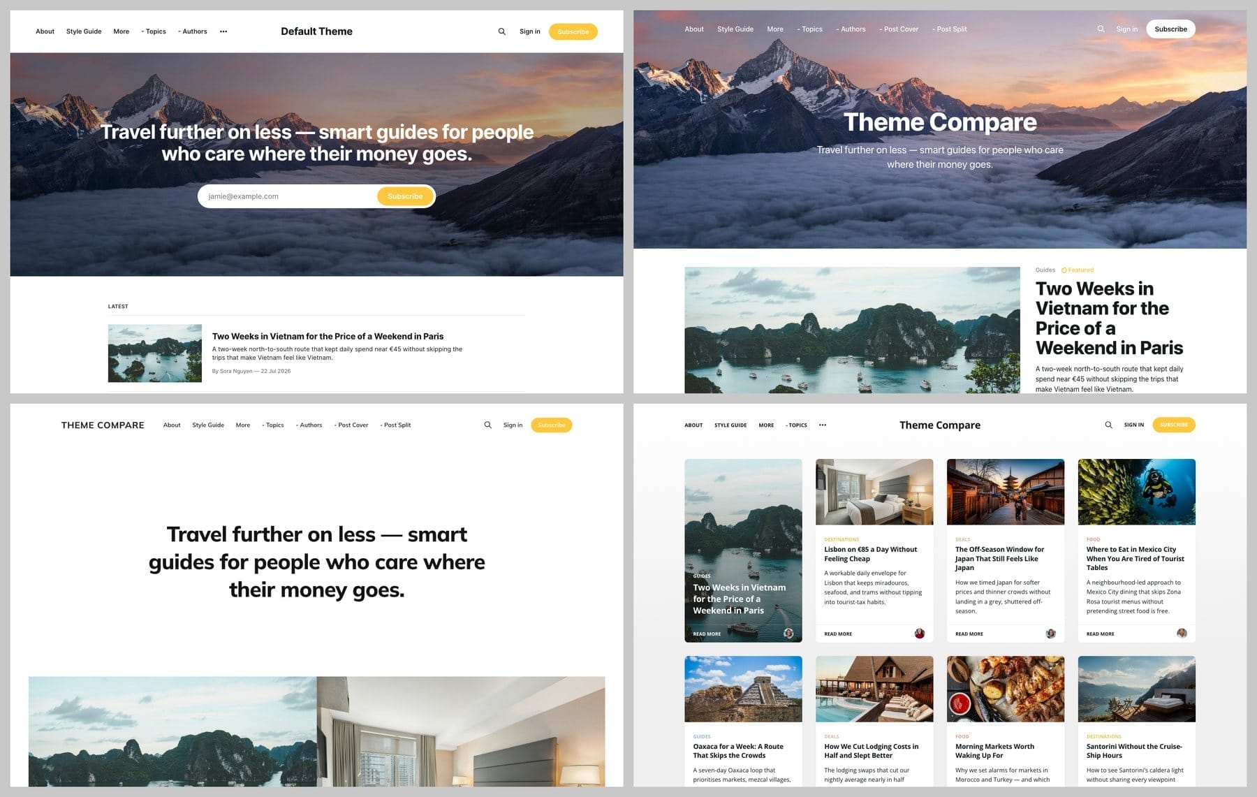
Home pages
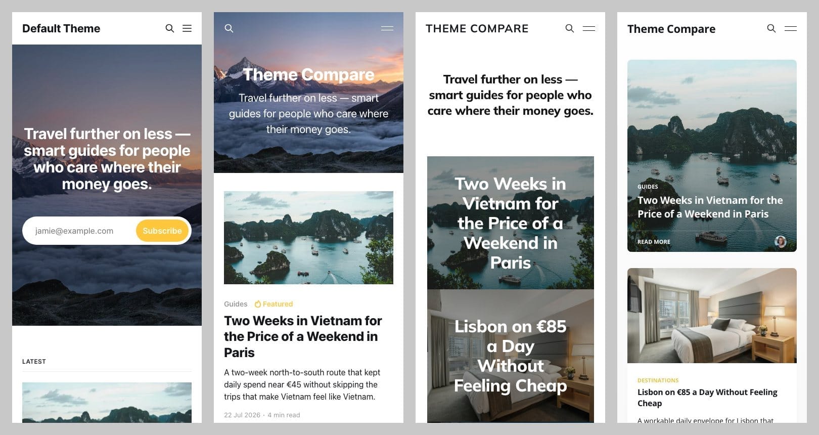
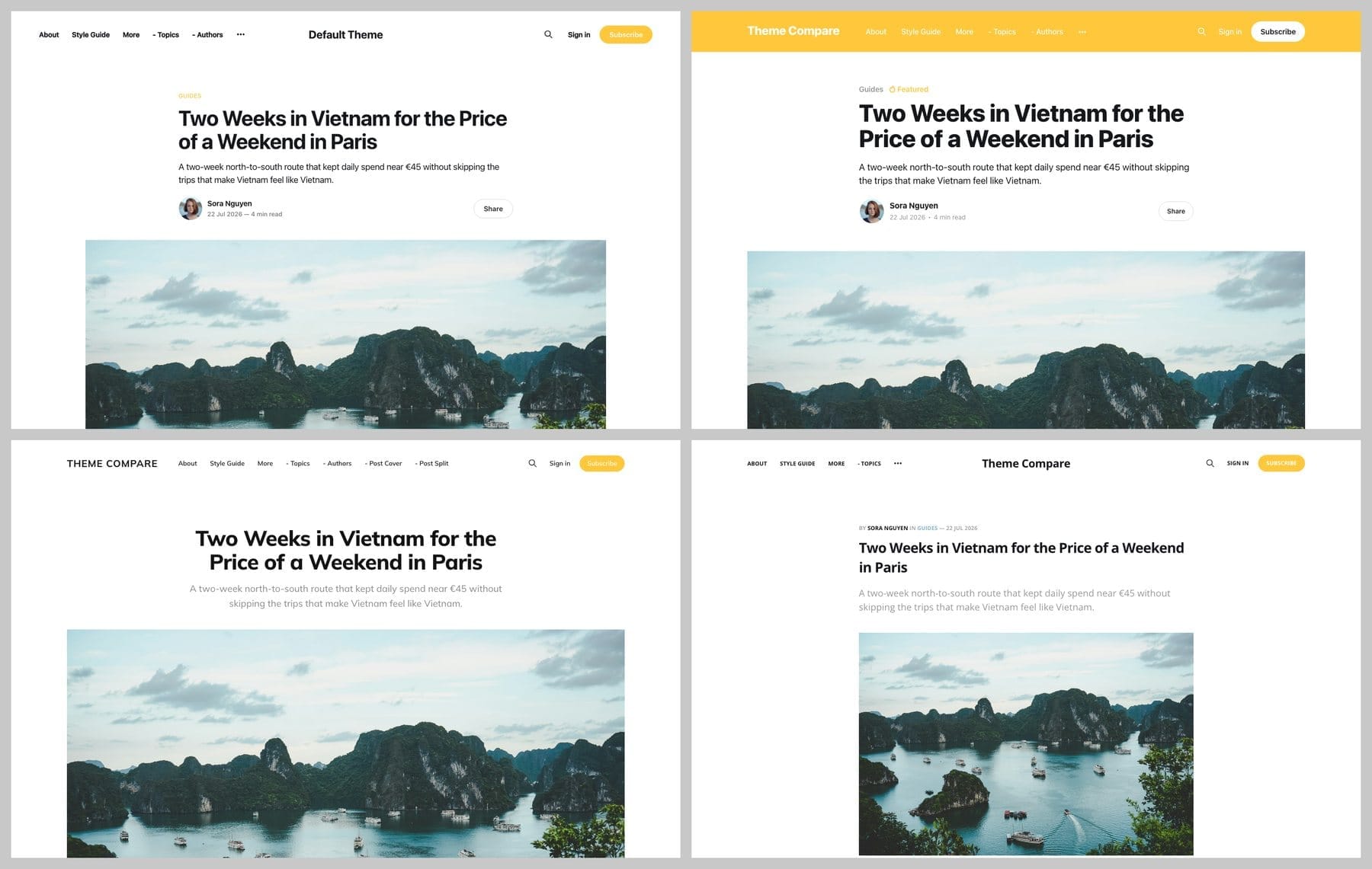
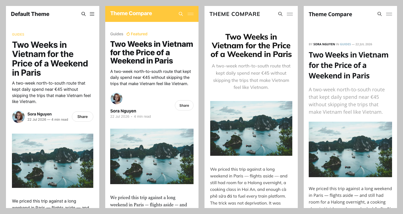
Every image runs in the same order: Source, Casper, London, Ruby. Tap an image to open it full size.
Post pages
Strengths and weaknesses
Source
A full-width hero with an email signup box, then your posts in a plain list. Post pages are a narrow text column with a tag, a summary and a Share button.
- Strength: the most flexible of the four. It has 19 settings, including five header styles, so you can change a lot without touching code. The signup box sits on the first screen.
- Weakness: on a phone the hero fills the whole first screen, so your posts start below it. The list layout is plain, and it is the theme most Ghost sites already use.
Casper
A centred title and tagline over a cover image, with the featured post large beside its image. Posts use serif body text, and your accent colour runs across the whole top bar.
- Strength: it feels like a personal blog. One featured story gets the spotlight, and you can choose a light, dark or auto colour scheme and a classic, grid or list feed (10 settings).
- Weakness: one story gets the big space and the rest wait below it. The first screen depends on your cover image, so a weak image shows.
London
A huge centred headline with big image tiles right under it. On a phone the home page is a stack of photos with the titles written over them.
- Strength: your photos do all the work, which suits photographers and visual magazines.
- Weakness: it is only as good as your images, so text-heavy posts look bare. It has just 3 settings, so changes beyond fonts and the menu mean editing code.
Ruby
Four columns of small cards on desktop, each with an image, tag, title, summary and author. It is one card per row on a phone.
- Strength: the quickest to scan. A reader sees many posts at once, which suits a site with lots to browse.
- Weakness: every post gets the same small card, so nothing stands out. The type is the smallest of the four and it has only 4 settings.
How heavy each theme is
I added up each theme's own files on a local site. All four come to about 8 to 10 KB of CSS and 18 KB of JavaScript once compressed. Ghost's own scripts and your images weigh far more than that.
What none of them do
- None has a layout built for a specific format, such as a recipe index or a travel itinerary.
- There is no dedicated support for these themes unless you host with Ghost.org.
Which one to pick
- Newsletter or general blog: Source.
- Personal blog with a classic feel: Casper.
- Photography or a portfolio: London.
- Many posts, quick scanning: Ruby.
- Something more specific: try Edition for newsletters, Edge for photography, Episode for podcasts, Ease for docs or Headline for news.
If none of them feels right, read how to choose a Ghost theme before you spend money.
Versions tested: Ghost 6.54, Source 1.7.1, Casper 5.12.1, London 1.0.0, Ruby 1.0.0. Newer releases of Source and Casper exist.


Discussion