
Colours and fonts
Colour schemes
Go to Settings → Design & branding → Customize → Theme and choose a Colour scheme.
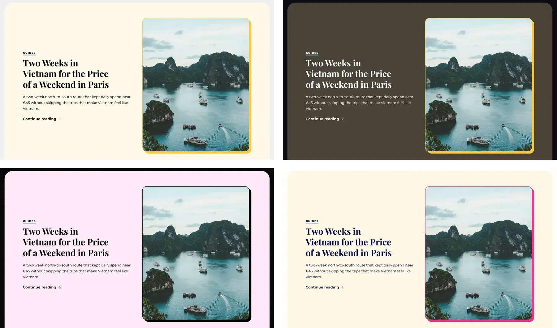
- Light (default): white site card on a light grey frame.
- Dark: dark card and frame.
- System: Light or Dark, following each reader's device.
- Pastel: soft pinks and blues on a dark frame. Has its own palette.
- Bold: strong blue, pink and yellow. Has its own palette.
Accent colour
Set it in Settings → Design & branding → Customize → Brand → Accent color. Light, Dark and System use it for buttons, highlights and the hero. If you keep Ghost's default pink, Stretch uses its own default instead: brown in Light and amber in Dark. Stretch picks black or white button text, whichever is easier to read. Pastel and Bold keep their own colours. To change colours that have no setting, see Custom colours.
Fonts
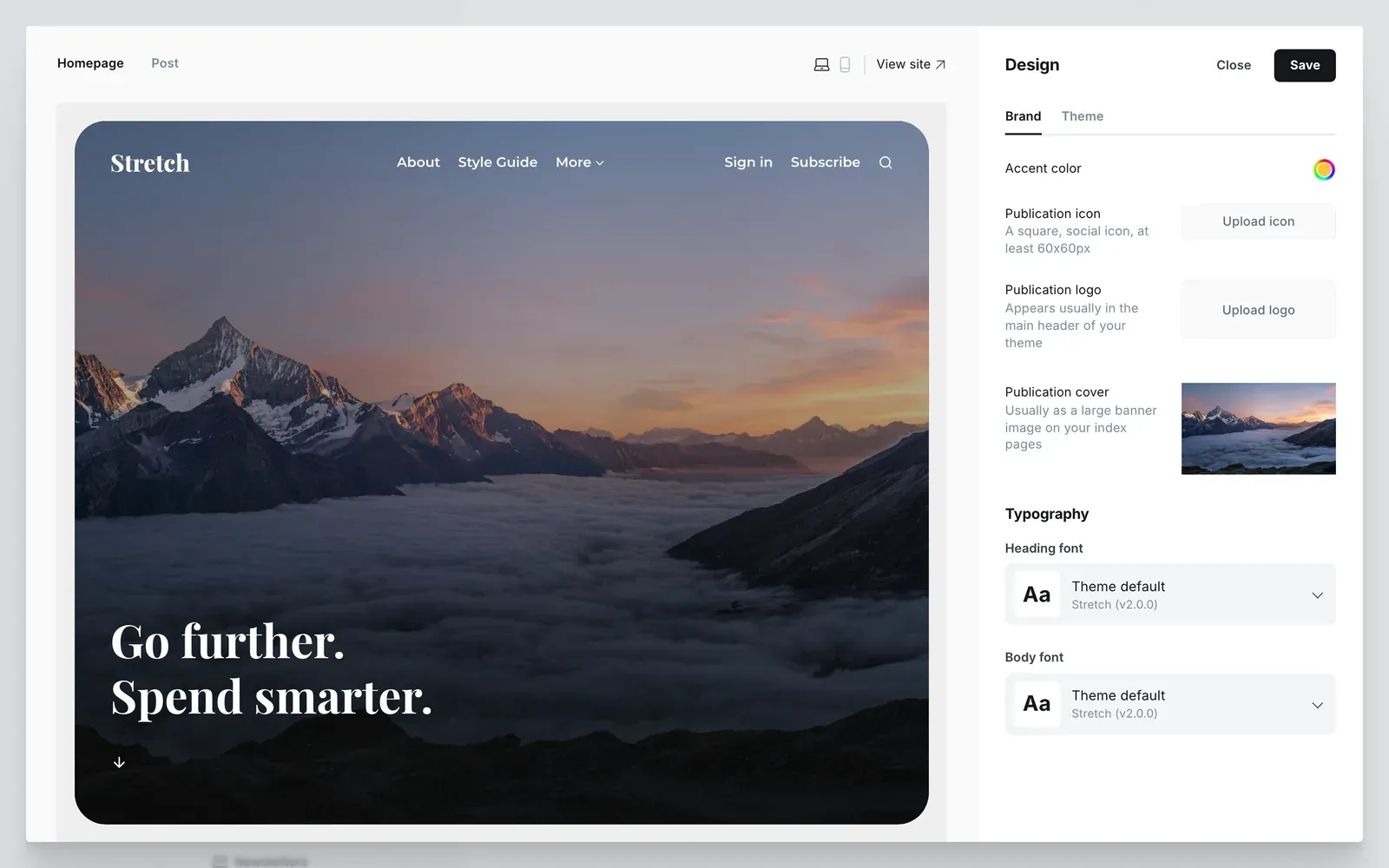
Stretch uses the Heading font and Body font you pick in Settings → Design & branding → Customize → Brand, in every colour scheme. If you leave them on the default, Stretch uses Montserrat for text and Playfair Display for headings. Both are bundled with the theme.
Background colour
Change the frame around the site card with the Background colour setting. It works with Light, Dark and System.